The Dealer’s Argument: Reading Installation Choices on a London Fair Stand
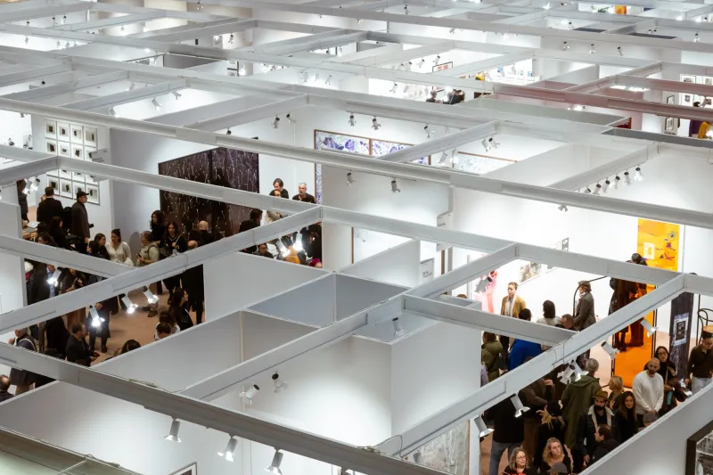
At a London fair, the first thing a stand does is make an argument. Before the price list is opened, before the invigilator has offered a greeting, the walls have already proposed a version of the dealer’s programme: how it wants to be read, which artists it believes can carry a room, and how much risk it is prepared to show in public. Installation is not decoration. It is the visible edge of a commercial judgement.
The First Twenty Seconds
Approach from the aisle and notice what the stand asks you to see first. A strong installation usually has a clear point of entry: one work that holds the centre, a run of works that builds along a wall, or a deliberate view through to the back of the stand. Sightlines matter because fairs are crowded, interrupted spaces. A dealer who understands this will place the most demanding work where it can be seen without competition from a neighbouring stand, and will keep the approach relatively clear.
In the marquees of Regent’s Park, or in the grander rooms used by older London fairs, the architecture imposes its own terms. Daylight, tent structure, columns and carpet all affect how a stand reads. The best exhibitors work with those conditions rather than against them. A stand that feels composed from the aisle is usually the result of decisions made long before the first morning of the fair.
Salon or Statement
One of the clearest signals is the choice between a dense salon hang and a single-artist presentation. A salon hang proposes breadth. It says that the dealer can hold several artists in conversation, that there is a collecting history to be entered, and that the stand rewards comparison. It can feel generous, but it can also blur individual works. When it is done well, the density is rhythmic rather than crowded; when it is done badly, the eye has nowhere to settle.
A solo presentation is a different kind of claim. It stakes the whole stand on one argument, and it raises the cost of failure. The dealer is not offering a menu but a conviction: that this artist can sustain a room, a conversation and a price level without support from neighbouring names. For a collector, that confidence is useful information. It does not guarantee quality, but it shows what the dealer is prepared to put behind the work.
Colour as Frame
The default fair wall is an off-white, and there is a reason for that: it is neutral, forgiving and familiar. When a dealer departs from it, the decision is usually deliberate. A deep colour can absorb light and make works glow; it can also make a stand feel theatrical, or date the presentation to a particular mood. A pale grey or warm white may be chosen to soften a hard daylight or to flatter works on paper. A coloured wall is not automatically more ambitious, but it is rarely accidental.
Wall colour also affects how frames, glazing and edges read. A work that looks quiet against white may look assertive against blue; a photograph that seems cold under one light may warm under another. The collector does not need to reverse-engineer the dealer’s paint chart. It is enough to notice whether the wall is helping the work to speak clearly, or asking the work to compete with the room.
Light and the Honest Edge
Lighting is where installation becomes most practical and most revealing. Track lighting can be adjusted to graze a surface, to reveal texture, or to flatten a painting into a poster. Over-lighting is a common fair temptation: it makes a stand bright from the aisle, but it can wash out subtlety. Under-lighting can create drama, but it can also hide condition and surface.
Look at the edges of works, not only their centres. Raking light shows the weave of a canvas, the relief of an edition, the sheen of a photograph. Reflections in glazing are a fairground nuisance, but they also tell you whether the dealer has thought about where a viewer will stand. If a work is difficult to see from the natural approach, ask to see it from another angle. A considered dealer will usually oblige.
The Meaning of Gaps
Empty space on a fair stand is expensive. A wall left deliberately bare is therefore a statement of sorts: it asks the eye to slow down, and it gives a single work room to breathe. Gaps can signal confidence, particularly when they surround a work of real quality. They can also be practical. Works may have sold, or been reserved, or held back for a client. The collector should resist reading every absence as a message.
What matters is the pattern. A stand with one generous gap feels edited; a stand with unexplained holes feels unresolved. The difference is usually visible in the pacing. A good hang moves from work to work with a sense of interval, like a well-sequenced exhibition. A weaker hang treats the wall as storage with spotlights.
Confidence and Its Counterfeits
Scale, furniture, catalogues, fresh flowers and a well-dressed invigilator all contribute to the impression of confidence, but none of them is the same as it. A large stand can be underfilled; a small stand can be perfectly resolved. A corner site may offer better sightlines, but it also exposes the dealer to more angles of scrutiny. The useful question is not how much money has been spent, but whether the installation has a clear idea of what it is doing.
That idea is often most legible in the relationship between the works and the wall. A dealer who hangs a single small painting in the middle of a large wall is making a claim about attention. A dealer who fills every centimetre is making a claim about abundance. Neither is inherently better. The collector’s task is to notice which claim is being made, and whether the works can support it.
How to Use the Cues in Conversation
The point of reading a stand is not to turn the booth into a puzzle to solve. It is to arrive at a conversation with better questions. Rather than testing the dealer, ask something open: how the hang came together, whether the wall colour was chosen for the works, or whether this was conceived as a solo presentation from the start. The answers will tell you a great deal about the dealer’s working method.
Listen for whether the response is centred on artists or on logistics. A dealer who speaks about the pressure of a particular wall, the decision to leave a gap, or the difficulty of lighting a surface is usually a dealer thinking about the work. One who speaks only about square metres and fair costs may still be competent, but the installation is less likely to be the argument.
A Collector’s Note
Installation choices are not a verdict on quality, and they should not replace looking. They are, however, a useful layer of evidence. A stand that reads well from the aisle, that uses colour and light with purpose, and that leaves space where space is needed is likely to have been thought through by people who care about how art is seen. That is worth noting before the price conversation begins, and worth remembering when the fair crowd has moved on.